What Is Responsive Web Design?
What is responsive web design? Responsive sites are favoured by Google and loved by users, which is why so many people want to know more about them.
 AuthorZet Digital Team
- schedule
- article2 min read
tocContentsexpand_more
What Is Responsive Web Design?
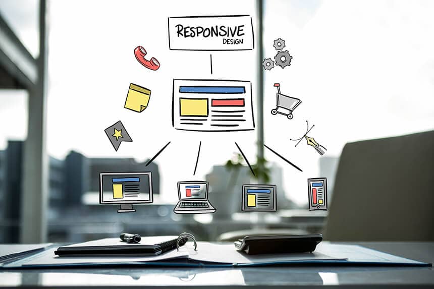
What is responsive web design? Responsive sites are favoured by Google and loved by users, which is why so many people want to know more about them. Responsive web design literally means a design that responds and adapts. It is the design approach people come across most often when researching web design, and it has only been in wide use for around ten years. It quickly became popular because it optimises a website’s content for the device it is viewed on, whether a phone or a tablet. In other words, the site appears in its standard layout on a computer, but on a tablet or phone its content is rearranged to fit the screen. Thanks to this, the website can be viewed on mobile devices and tablets at full performance.
How Is Responsive Web Design Done?
Many people choose responsive web design because of the advantages it brings. Users avoid sites that are not responsive, as they are hard to read and understand. Responsive sites are preferred because they are easier to view and understand on the mobile devices people use every day. Responsive websites are built with HTML and CSS; beyond these, no additional programming language or software is required. Besides being straightforward to build, it is preferred for the advantages it offers.
Advantages of Responsive Web Design
With a responsive website, users can easily open the site on the mobile devices that are most widely used today and reach all of its content without effort. When users visit a site that is not responsive, the text and images appear small, reading becomes difficult and they leave the page. On responsive websites, images and text adjust automatically, and the design that adapts to the screen size makes everything easy to read. Because both images and text are easy to understand, the site is easier to use and preferred by many people. Beyond appearance, moving between pages and tapping with a finger is easier because elements are sized for the screen, which gives the site a smooth, easy-to-use experience. For detailed information, you can visit our contact page.
Follow Us
Author
Zet Digital Team
Since 2017, Zet Digital LLC and our production team in Türkiye have run web design, SEO, Google Ads and social media projects. The guides on this blog are based on methods we apply ourselves in client projects.
Meet our teamarrow_forward